Wednesday, October 24, 2007

Shading

Desk
When we broke off to shade on our own, a bunch of us decided to wander downstairs to the empty classroom. We turned off all the lights, opened one window blind, and drew chairs. The light was really pretty and it was so peaceful.I got this far on my drawing and then a teacher walked in and told us we had to leave because there was a class. I think it turned out okay despite the fact that it is not finished, and I think the diagonal shading worked well.

My Best Friend
I used smudging to shadow the coffee cup. Except for a few details, I think it turned out well. The coffee in it was not bad either!

Rubber Cement
When I started this, I did not realize how difficult it was going to be. It was so hard to see the light and I must have moved at one point because the shadow was completely off. It is smudging as well.

Sunday, October 21, 2007

1. HOK
HOK
’s website was very cool! Their work is amazing and there is so much of it. The site is really compatible with the projects, making it far more appealing. It welcomes you with a slideshow of the company’s various projects. Though interesting the slideshow may have been, I was a little thrown off with confusion as how to actually enter the site; there are no indicators. As I scrolled around the page, I noticed that the only text on the screen would follow me. This ended up being the menu for the rest of the site. I enjoyed the bit of interaction, but I still wish there was more direction. After finding my way into the actual site, I was impressed with the organization of the layout. One has no trouble navigating around. The web designers took a simple approach when it came to the graphics. The grey background complements the images and there are no frills that would distract the viewer. It is a smart design for smart designers.
2. Mancini Duffy-
Honestly, this is not a favorite of mine. I’m sorry to say, but the graphics look rather unprofessional. Both the font and graphics are just too plain. Visiting the main page alone, I would not have the urge to go any further. In other words, it does not grab me at all. Though I may not like this site, I can’t deny that the layout and navigation are very simple. There is no confusion when it comes to getting from one place to another in the site. Those are the only things going for it though. The pictures are too small to really see and their resolution is really bad. I'm sure this firm is great, but the work does not reflect in the design of the website.
3. Colvin
When I browsed for design firms, I came across Colvin Designs. As I clicked on the site, I was impressed with the introduction of the site. Quotes scrolled across the page, raving about the designer in question. My eye was drawn to the center of the screen, not only because of the moving words, but also because the page is sectioned into three parts, with font and pictures only in the center. I thought that was a smart idea. As the introduction ended and the site opened, I could not help but feel let down by the overall appearance of the site. I have to admit, the layout is clean and not overpowering, but the information and project images where nothing too special. They were small in size and in numbers. I wish there would be more examples of the work.
4. Rmjm Hillier-
RMJM’s website is a perfect example of good layout and graphics. The site has color, but mostly white space. The menu is on one side, which makes access very simple. Each label is a different color and as you click on each, it will bring you to the corresponding page. All of the colors on the page match the colors in the menu bar. I found it smart that when I clicked on a label from the menu, the label actually elongates across the page, which made my eye follow it. Equally important is the interaction incorporated. In order to look at projects, you have to drag the thumbnail image into a box, in which it will resize to show it. As I looked more at the page, I noticed the clocks at the bottom. Each clock tells the actual time in each zone. It is not something I would ever think of, but I think it is an interesting idea nonetheless. I really enjoyed this site.
5. SSDG Interior Design-
Good first impression. It is a clean layout and it works really well. All of the information is centered in the page and is surrounded by blank space. I appreciate that idea because my eye was drawn to the center upon entering this site. The layout has no real bells and whistles, therefore pain navigation, and the firm’s portfolio is amazing; it is so unique. They did a great job!
6. EYP-
This site is ranked high as one of my favorites. The flaws are so minimal if there are any at all. The graphics are simple and to the point. I like the way the background is a gradient scale; it makes the eye travel across the page, along with the shading. I also enjoyed how the menu was on one side while the descriptions and additional information was on the other; the organization works well. The only problem I had with the site was that I had trouble accessing a few links but that is a technical problem that can be easily fixed.
7. Spillis Candela DMJM
Design Firm Spillis Candela DMJM has a well rounded website in my opinion at least. The site is surrounded by color (but not in an unappealing way), the graphics are simple, yet intriguing, and the layout has good flow. I think the circles add a nice touch and I think it is good that they incorporate the menu into the site. This firm’s website also has continuity with the design, which is great. I had fun exploring this site; the portfolio is amazing and very substantial.
8. DBI
DBI’s website has a lot of excellent components, but I think it is clear that the site is so interesting because it is so interactive. The Introduction is playful yet serious and it does a good job foreshadowing what the actual site will look like. The graphics of the site are well designed. The main site is largely a black backdrop. The firm’s information rests in the middle on a grid pattern. The contents of the menu takes up an individual square on the grid and when you scroll over a menu square, branch links will appear in the nearby squares, allowing the viewer to see what there is to offer. When it comes to the layout, apart from being detailed, I think it works very well. With each click to the next category, the site changes itself and opens to reveal even more interesting material. Though I don’t particularly like the work of Dbi, I find the website makes up for it.
9. Heery International.
The designers at Heery International have an excellent, not to mention very dynamic portfolio. Honestly, I wish I could say the same for the website. It is too boring for my taste. There is a difference between simple and boring, and this site has crossed the line. It has no real spark to it and because of it; I did not spend much time looking around. This is not to say that everything is wrong with the website, in fact, I think the organization and layout is great. The layout is the same for every branching link. There is a purple stripe that borders every link and I appreciate that. I think the designers could add a few alterations and it would immediately appear better.
1o. Studios Architecture-
Studios Architecture’s site is another simple yet dynamic website. The actual page is very simple. There is a large picture and the main menu is placed in a band at the top. When a category in the menu is clicked on, the page does not change, rather the sub-categories create a stair effect to the next selection. I liked that they chose not to change the page throughout. It makes the site simple in a way, but very dynamic as well. I have not seen another website do that before.


Thursday, October 18, 2007

Zine


When I was flipping through pages, looking for the ten products, I could not seem to find something that truly interested me. I was looking in this one magazine that had an abundance of chandeliers of every variety. After that, finding chandeliers was so easy! It is always fun to see how traditional or abstract one classifies a product as.
I wanted the zine to be clean and organized. There is a blue stripe on every page and the pictures are all the same size. The one thing I had trouble with was scanning after I had assembled everything. It looks wrinkled when it is not really.

Friday, October 12, 2007

Work Together!

The two projects I chose from were Philip Mancuso and Sarah Zale's Project.

Thumbnail Sketches


I chose the the two ideas not just because they were my favorite of each person's, but also because of the fact that they would match together in an interesting fashion. Regarding the thumbnail sketches, I did have little bit of problem coming up with the various ideas for it.

Philip's Egg PlaceMore Egg, Less Memory

I like the idea of Philip's inverted topographical map. I wanted the ideas all to have the same stepping idea of the map. In this case, since this idea is closer to Philip's, I believed the characteristics should only hint at Sarah's, which is why it is in cube form.

Combination of the Two
I like how this came out. It is the middle ground of the two initial projects. I made four cubes with an open side on each. Every side has only one open box with the shards inside. It has the cubes and spikes of Sarah's project while still stepping upwards, like Philip's.
More Memory, Less Egg

This idea looked better in my sketchbook. I think it would have been better with more thought and patience. I wanted to literally play up the colors as well as shards sticking out.

Sarah's Memory

Thursday, October 11, 2007

Studio is...

I.D's Double Layout
This double layout is from I.D magazine, the July/August edition. I really liked the idea of having images layered on top of each other, with one creating the background for the layout.

My Double Layout
I did not copy everything from the ad, rather I used it as inspiration. I really wanted the layout to capture the essence of just what makes studio studio. The dedication and learning experiences are what stood out in my mind when I was thinking of ideas for this project. I think it turned out alright.

Monday, October 8, 2007

Artistic Autograph


So, this was our first "short" project, and I must say that I did not enjoy some of it (i.e- the display structure!!!!!). This is not to say I disliked all of it; I really liked the self portraits. It was time to turn the tables, and instead of analyzing others, we were now to analyze ourselves. When I sat down and started to draw myself in eight different ways, I began to notice small details that I hadn't before, things that I would not notice because I can't actually see my features all of the time.
I had the hardest time with the structure to display the images. In the beginning, I sketched the design before I did the portraits. As I worked on the portraits, my structure altered and seemed to get more intricate. By the time I was finished with all of the drawings, I had this idea for a structure that was way too overpowering. I ended up making it fairly simple so that the images would be on display, not the piece holding it. I thought the construction would not be too time consuming, but was I wrong! It took forever! By the time I finished, I could have kicked and jumped all over it. The structure refused to stay together. I used every single glue product that I had, and it still would not completely hold.
Though I still remain frustrated with the structure, I am very happy with my self portrait project. The images turned out well and the structure holds up, just as long as you don't poke at it too hard!!!

Tuesday, October 2, 2007

All Those Memories

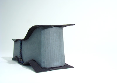
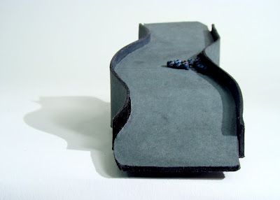
Final ProjectSo, I did not change too much from my second iteration. I solved the infinite problem by connecting the edges so that it never stops. The seams are covered with the beads on either side. I felt it would be impacting if I made both sides the same for it would really make it seem never ending. I have to say, I did not care for the final project as much as the second iteration but I was satisfied nonetheless.
Second Iteration
I actually enjoyed this iteration. I wanted to hint at a creek without completely giving it away and I think I accomplished that. The beads symbolize my playtime buddies. One thing I had trouble with was creating a sense of flow and a never ending quality. I thought our creek went on forever and I wanted to capture that in this piece. The endpoints are just that and I did not know how to show infinite.
First Iteration
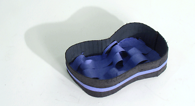
I don't really like this iteration. This memory I have is so strong that I had trouble figuring out what i wanted to incorporate into it. It did not turn out how I planned, but it did help me understand which direction to take from then on.

My Memory
When I was four, I moved into a new house with a creek in the backyard. The way I made friends was through the creek. Since it runs through the backyards of the neighborhood, all of the kids would meet up and play in it. Naturally at such a young age, I thought the creek was so massive; walking up and down the creek would become such an adventure. In reality, the creek is much smaller, only a few feet wide. My memory is not so much about playing in the water as much as youthfully bonding with others.