Thursday, April 30, 2009
Tuesday, April 28, 2009
Final Project
Inspiration:
Upon entering the Warehouse, Lauren and I noticed the history it evoked. It was apparent that, with each new use of the space, a layer of the previous function was retained and left behind. Wanting to preserve the past, our initial design aimed to build on, all the while displaying the layers that this project had to offer.
Inspired by the simple, yet complex nature of a sedimentary rock, we were determined to create a space that would embody the qualities of this object so rich in history. Equally important was the idea of single layers bound together to create a unified whole.
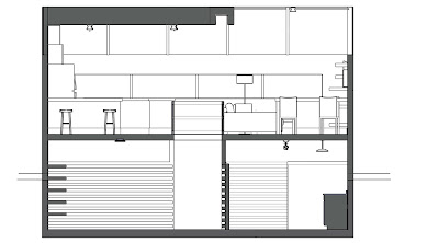
A unified whole was prevalent in the layout, as well as overall schematic design of the space. The units would be a universal size of 25’-0”x 36’-0.” The exterior of each unit would remain simple; the layers within from the residents would personalize the spaces and thus create unique interior atmospheres.
Building on the concept of Stratification, it was apparent that the units would have to interact with all layers of the building in order to be successful. Instead of lofting up, the excess space would extrude into the ground, and protrude into the level below. Designed to accommodate either parking or storage below, the unit itself, as well as a rooftop Terrance above, the residents would own every layer of their 900 square foot space. The residents would, in turn, literally live within the layers of their space, as well as the Warehouse itself.

Individual Space:
Concept: Exposed Antiquity
The design utilizes the idea that the space is kept open and simple; it is up to the residents to manipulate the space and thusly display the layers of their lives via their possessions. Since the concept pertains so much to layers, horizontal orientation is highly relevant; vertical elements are rare. The main horizontal elements in the space are the interactive wood paneled walls. They penetrate both levels of the space and, in doing so, bind all layers of the unit together. They are considered interactive walls due to the fact that all of the other separating privacy walls and storage extend and extrude from the main wood walls. They create spaces and shelving units for residents to place their belongings; almost as if they are creating artifacts and moments within the layers.

The two other walls of the unit would remain white. Seen as blank canvases for the residents to manipulate, the white balances the wood, thus eliminating a visually overwhelming space.

Once again, the layout was determined by the overall layer design, as well as manipulation of the building itself. The space is, therefore divided into three categories: public, semi-public, and private. Each function has a form of separation with the public space on the top, and the rest layered below. The three spaces share a common origin; they are all centralized from the unit’s focal point, the staircase.

The central staircase literally cuts through the layers, thus exposing each layer within. In addition to the main staircase, stairs step up to the living space above, while stairs step down to make room for supplementary living space below. Descending the staircase, the further one goes into the space, the more private it becomes. Simple in design, the staircase in itself, is comprised of horizontal layers. This is to say that the whole staircase is made up of smaller, exposed entities.
Open Nature:
The space was kept open to maximize light exposure, as well as accessible flow. The spaces are minimally divided, with horizontal elements and materials insinuating separation. Due to the open plan, full interior walls are kept at a minimum and doors are places only where necessary.
Lighting:
It was important that the unit included a lighting design that achieved a sense of openness via natural light sources. Windows o the outside are placed in the public living space. Wall windows trim the ceiling and therefore connect the unit to the surrounding factory. Kept open, light is meant to filter through the stairwell, into the spaces below. Where light cannot penetrate, and for the night time, artificial lights are dispersed accordingly.
Materials:

As mentioned before, the materials are kept simple. They are used as both a navigation tool, as well as backdrop to the resident’s possessions.
Floor: Cement with Darker Wood Datum Line that runs the length of the unit, connecting the stairwell to the space itself.
Walls: The walls would be a medium wood paneling as well as the extruding storage
Kitchen: Black and White walls counters with a sedimentary rock countertop such as limestone or sandstone in a very neutral color.
The color would present itself in the wood, but more importantly, in the belongings. The homeowners are able to bring life to their space, and thus create their own record within the layers.
Final Individual Layout
WPA Poster

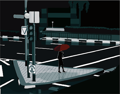
As the last assignment for our visual communication class, we were to create a poster that voiced our views on a certain topic. Opinions aside, they were also meant to draw inspirations from the mid century WPA posters.
The WPA posters were a way to visually communicate to the viewers of the time. Combining Graphics with Communication, these posters supported the addition of art in daily life. The Posters seemed to be one of two formats; either strong in graphics and simple in text, or the exact opposite. I chose my graphic to carry the piece, using as few words as possible. I wanted the poster to carry itself with little explanation. Though simple it may be, it was in the simplicity that the original posters made such an impact. The composition aided the power of the message, rather than detract from it.


.jpg)
